General Assembly: Curriculum
Developing a visual design curriculum for a user experience design course

Background
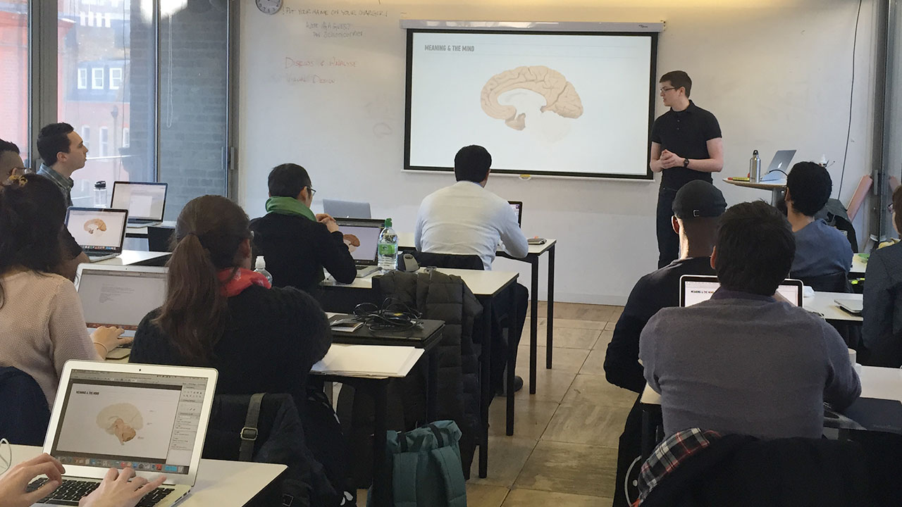
The User Experience Design Immersive is one of General Assembly’s flagship courses, designed and taught by practicing UX designers to prepare students for a job in the industry. The course was originally eight weeks long, but there was a demand from alumni and employers to teach more visual design and front-end web development skills. Students were also concerned that there was not enough time during classes to create a portfolio.
In response, General Assembly added two more weeks to the course, each focussed on visual design and front-end web development respectively. When these weeks were piloted they tested poorly. Feedback from students and instructors was that the weeks seemed segregated from the rest of the course, lacked a cohesive project or focus, and that the visual design curriculum was superficial.
As part of the instructional team, I was invited to discuss the curriculum at General Assembly’s Instructor Summit. We decided to rewrite the curriculum for both weeks and unify them with a project for developing a portfolio. I was responsible for rewriting the visual design curriculum and the brief for the portfolio project.

Curriculum Development
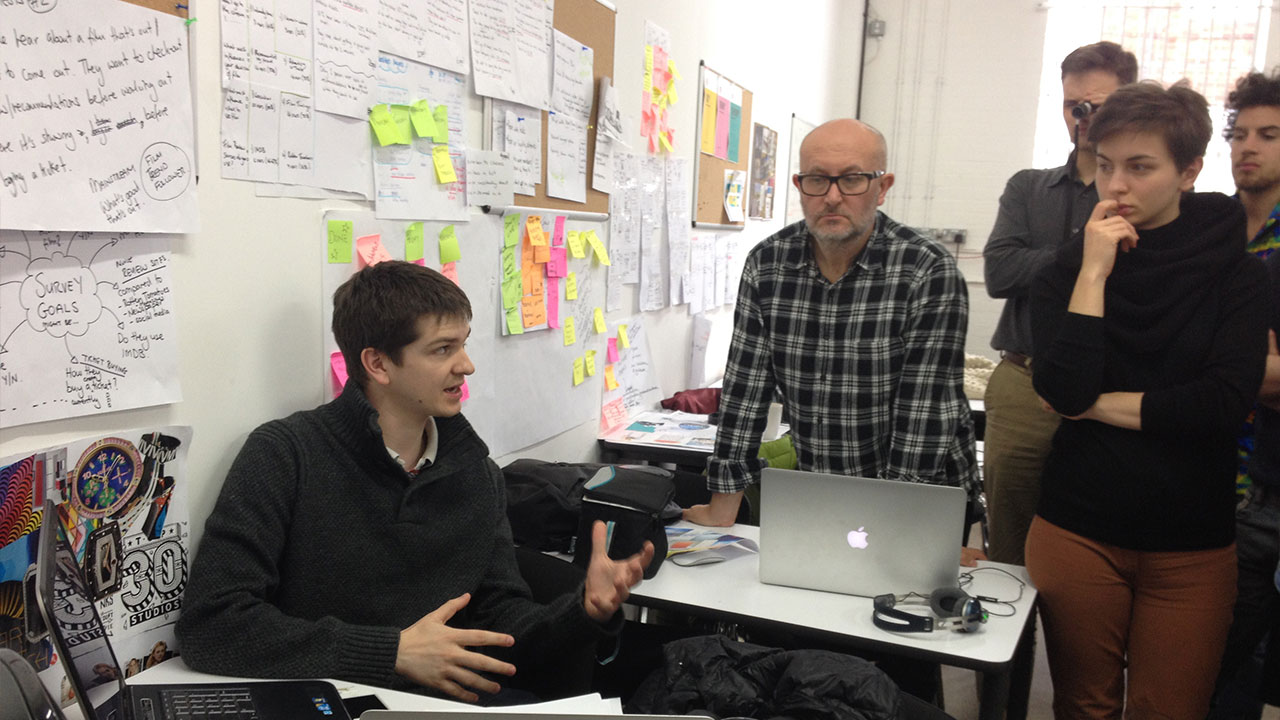
Before rewriting the curriculum I identified the essential learning outcomes for students through interviews with design professionals, instructors, and alumni. I determined what currently worked, what could be improved, and what was missing in relation to these learning outcomes through a content audit of the existing curriculum.
I introduced fundamental visual design theory principles that were missing from the original curriculum - such as gestalt and semiotics - and explained their role within user experience design. This helped students to understand how to utilise layout, imagery, colour, and typography to communicate the heuristics, interactions, and brand identity of a digital product. I also introduced ideation, testing, and analysis methods to give students the ability to be creative while still being objective.
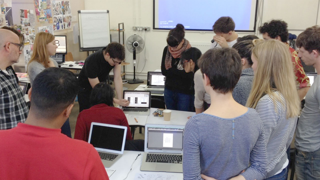
For the project, it was evident that designing and coding an entire portfolio website would have been too demanding for students while learning two new subjects. The objective for the visual design week was to design a single case study web page, which would be coded during the front-end web development week.
“Everybody remembers a great teacher. Steve’s ability to effectively communicate complex concepts is a testament to his understanding of design. His ability to effectively teach these concepts is a testament to his understanding of people.”
Austin Keeble, former General Assembly student
Initial Results
The new curriculum was generally regarded as a huge improvement on the original, however the project itself was preventing some students from effectively applying the visual design concepts.
While there were many students who finished the project to a high standard, a significant portion found that the personal nature of the portfolio project made it difficult for them to design objectively. This was compounded by the absence of any prior user research, which meant that the students didn’t fully understand the problem they were designing for.

Conclusion
Based on these findings, we iterated and improved the course even further. We maintained the new visual design curriculum, but separated it from the front-end web development week and developed a brand new project.
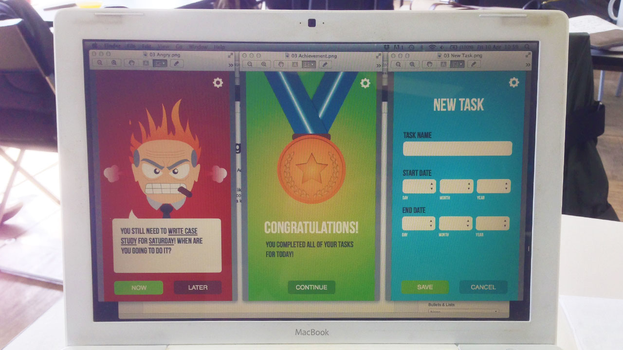
We asked students to design the branding and interactions for a mobile app that they had conceived in their very first project, in which they were required to identify a problem, conduct user research, and create rough interface sketches. This project proved to be a far more effective and consistant framework for students to apply their visual design skills.
