Sound Transit
Helping passengers navigate Seattle’s complex public transport network

Background
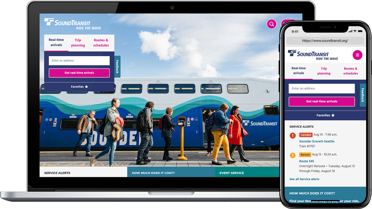
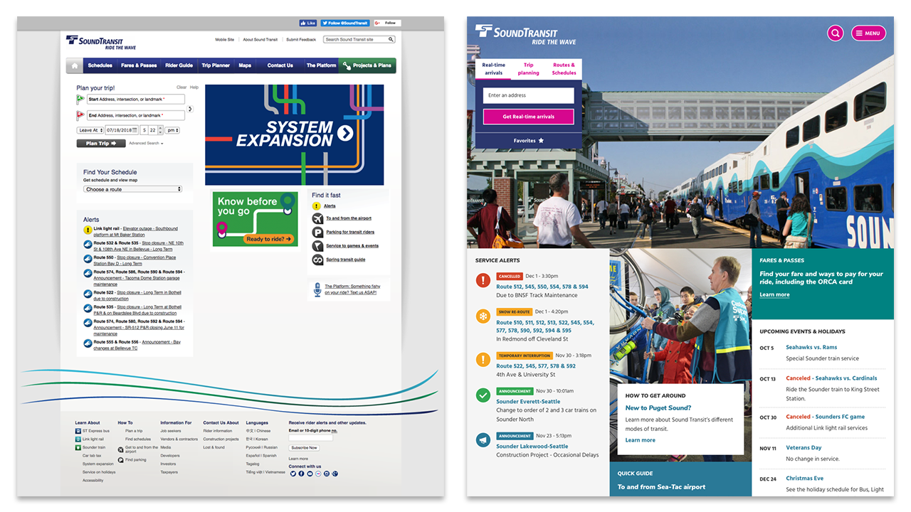
Sound Transit is Seattle’s equivalent to Transport for London (TfL), providing essential public transport services to America’s West Coast and carrying 47 million passengers each year. After undertaking a massive expansion of their transport system, Sound Transit needed to overhaul their trip planning tools and make their system expansion plans accessible to the public, as well as modernising the website’s outdated visual design.
I joined the team midway through the project having previous experience of designing trip planning tools for another US-based public transport service, Community Transit. My role was to complete the information architecture and user flows, provide user interface design and implementation support, and conduct user research during the public beta release.

Information Architecture & User Interface Design
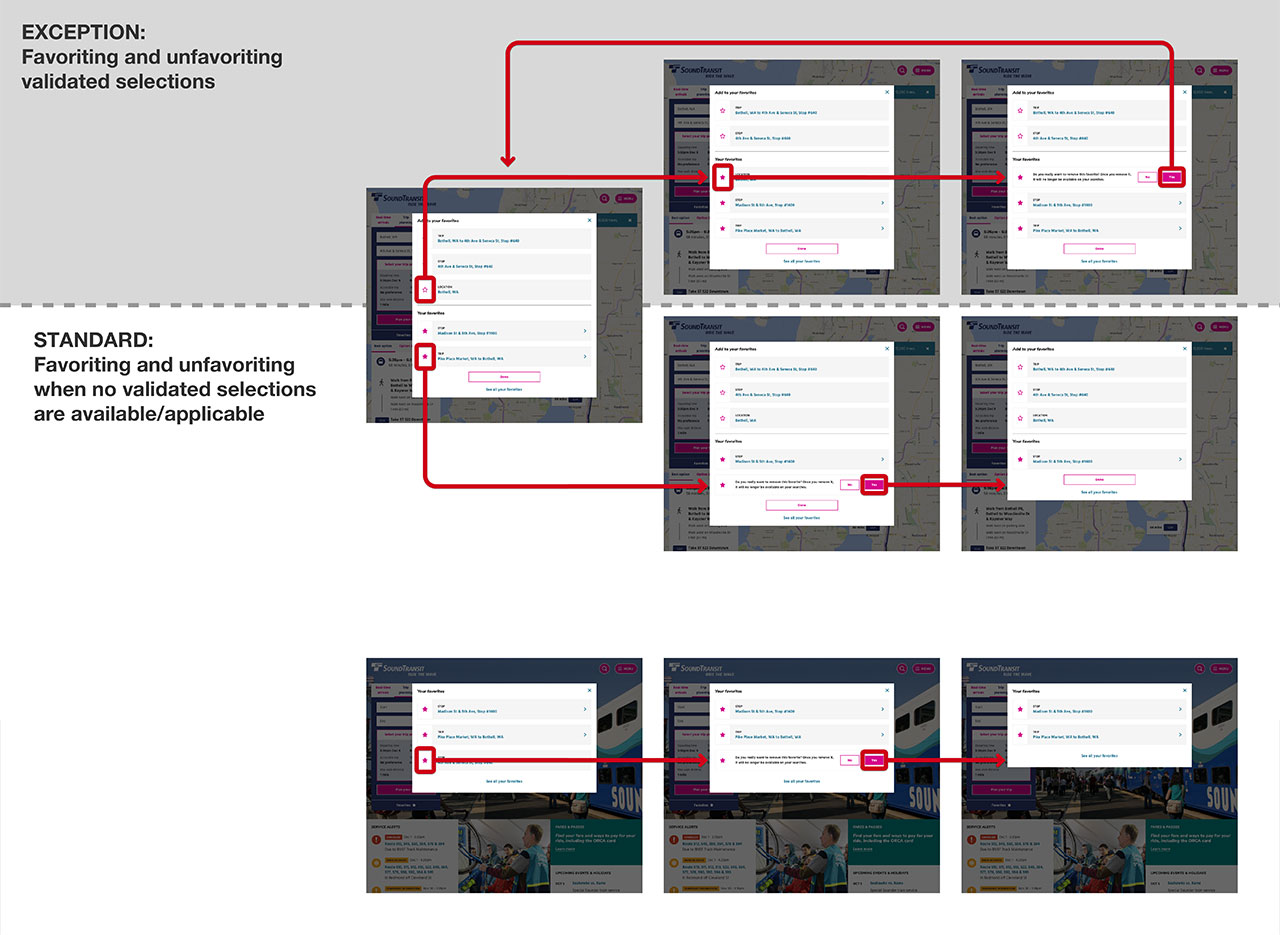
While the team was establishing a comprehensive visual design system, I developed the information architecture and user flows for features such as trip planning, live arrivals, service alerts, passenger information, and system expansion documentation.
Due to the enormous scale of the system expansion, there were thousands of documents and media types to organise. To ensure the average user could navigate this vast amount of data, I utilised existing research conducted with public transport users in the Seattle area and facilitated information architecture workshops with Sound Transit’s subject matter experts.
Once the information architecture and design system were defined, the team and I worked on the user interface design for each flow. We worked closely with the development team during implementation to ensure the designs worked as expected, and to make adjustments for any unexpected behaviours that occurred from using live transport data.

User Research
The website was released in phases so that users could provide feedback on the new design while still having access to the previous version that they were familiar with. I devised and oversaw the execution of a research plan for the public beta release, which not only provided insights into usability, but also gauged users’ impressions of the new visual design.
We began by conducting desirability tests - in which participants were asked to describe designs using a curated list of positive, neutral, and negative words - to determine whether our designs were considered to be an improvement or a deterioration.
This was followed by continuous onsite surveys, which tracked users’ attitudes and task completion rates over time. The surveys helped us to identify bugs and usability issues, and measure the impact of bug fixes and design improvements as they were implemented.
“First off, the accessibility of finding a bus near a given address is beautiful. Functionally, the site is damn good. Mobile is fantastic thus far, but desktop needs some cleaning up. But don't get me wrong, because this is way better than beforehand thus far!”
Quote from a survey respondent using the new Sound Transit website.
Conclusion
The desirability test recorded a 20% increase in positive attitudes toward our new design compared to the previous website. The onsite surveys corroborated this result with ‘better design’ and ‘easier to use’ responses having the highest frequency. Both results were significant as users tend to be critical and resistant to redesigns initially.
Conducting the onsite survey during the public beta release allowed us to target and resolve critical bugs and usability issues before the full release. Any feedback that was beneficial but not critical was added to a backlog for future releases.
“With this new website, Sound Transit finally feels like its the transit organization for one of the top tech hubs in the country.”
Nathalie Graham, The Stranger (local Seattle publication)